Over the last few years we’ve heard your feedback to reach comments faster, add longer descriptions, and to skip past sub-tasks (if you don’t need them at that moment). Today, we’re introducing a new task view fulfilling exactly these wishes.
Equipped with this valuable insight and feedback, we set about modernizing the design of one of the most important parts of a task manager – the task view. We set ourselves the goal to make you – and your collaborators – even more efficient when working with a task.
We’ve iterated on the task view across all platforms and improved the accessibility, making it better for collaboration and future proof. In addition, we focused on improving the visibility of task information and speed.
Here are the most important improvements that our newest task view redesign includes:
👁 Improved visibility
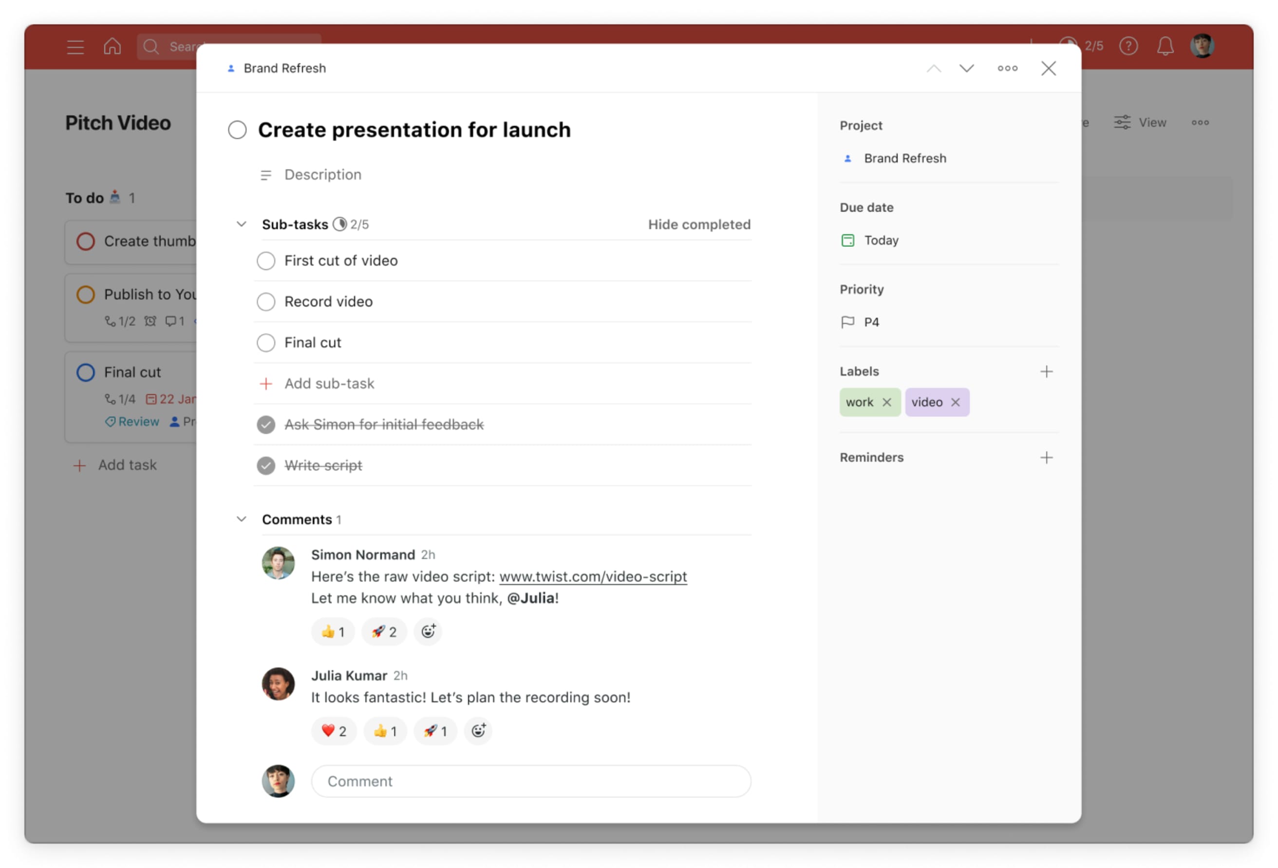
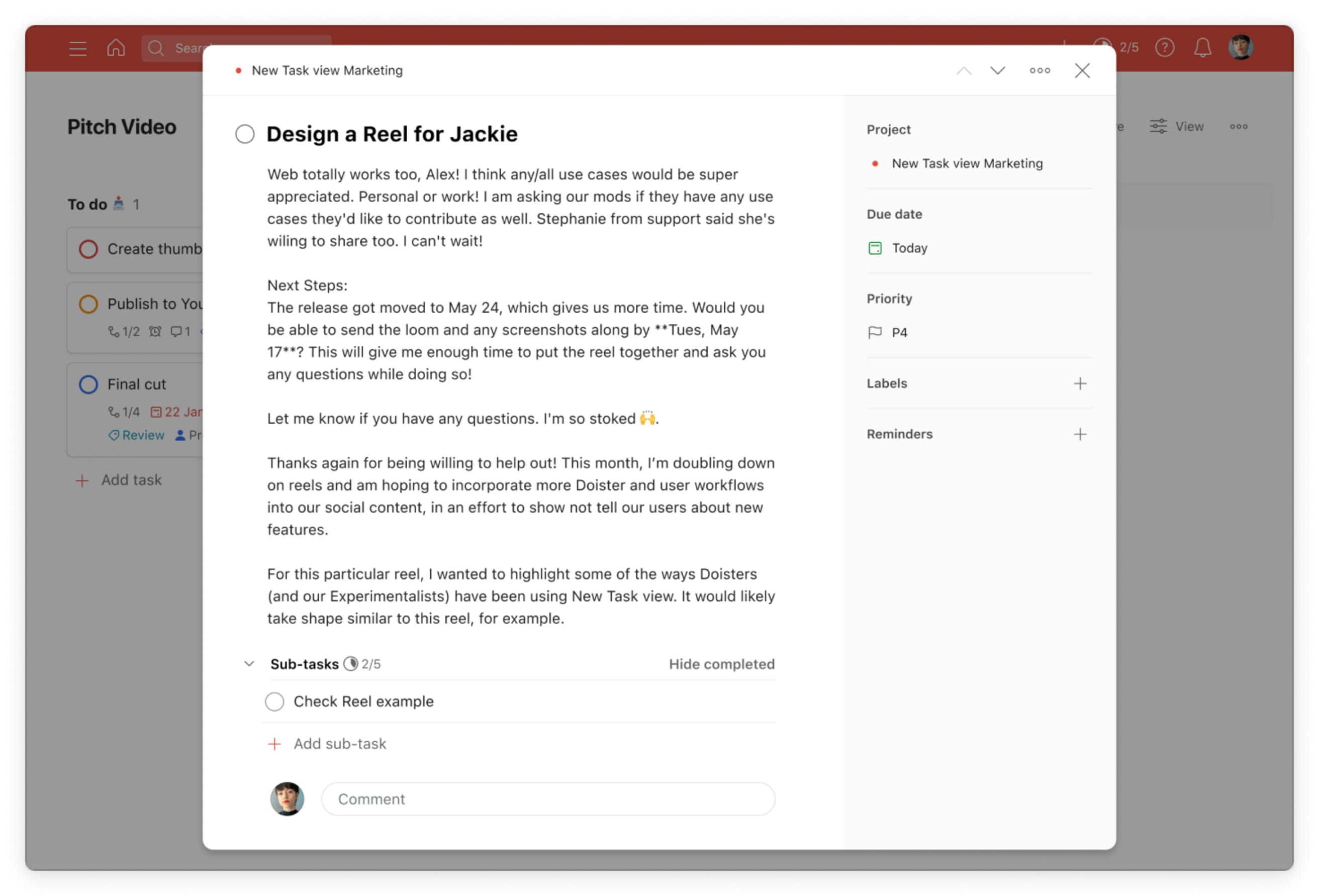
Redesigned layout gives you a complete overview: The most significant change is the layout. The new task view gives you an entire and complete overview of all your task information. That’s why we introduced a new content area and a new sidebar on the right-hand side. Everything’s visible in one place; no more tabs and clicking. On the left side, you can see your task name, description, sub-tasks and comments
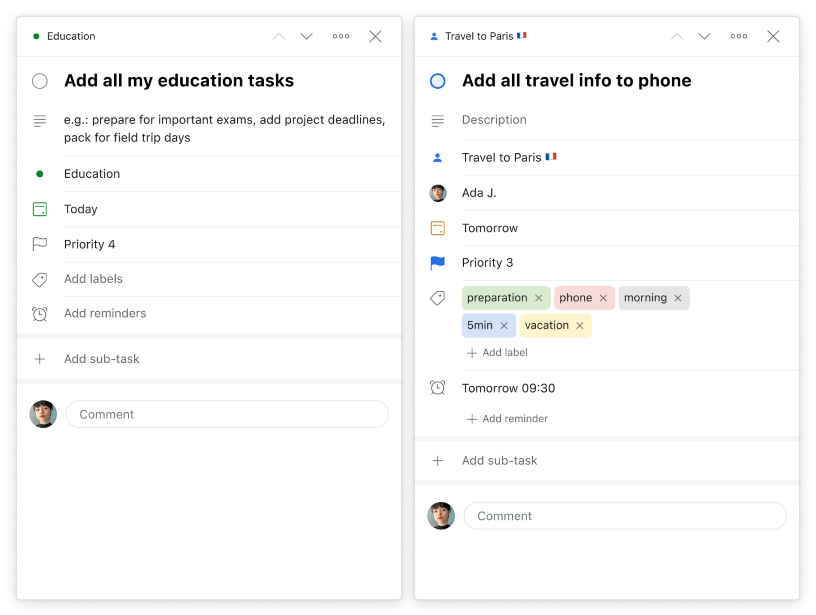
The new sidebar houses all other task attributes like the project, assignee, due date, priority, labels, and reminders. Previously we relied on icons, now attributes are written out for a more accessible experience. We also reordered these based on how frequently you use them.
PSST: In the future, this sidebar will also show integrations!
Focus on what’s important: Tasks can become lengthy. Many sub-tasks or comments mean that staying on top of things can be difficult. We know that focusing on the right information is essential, and every person uses the task view differently.
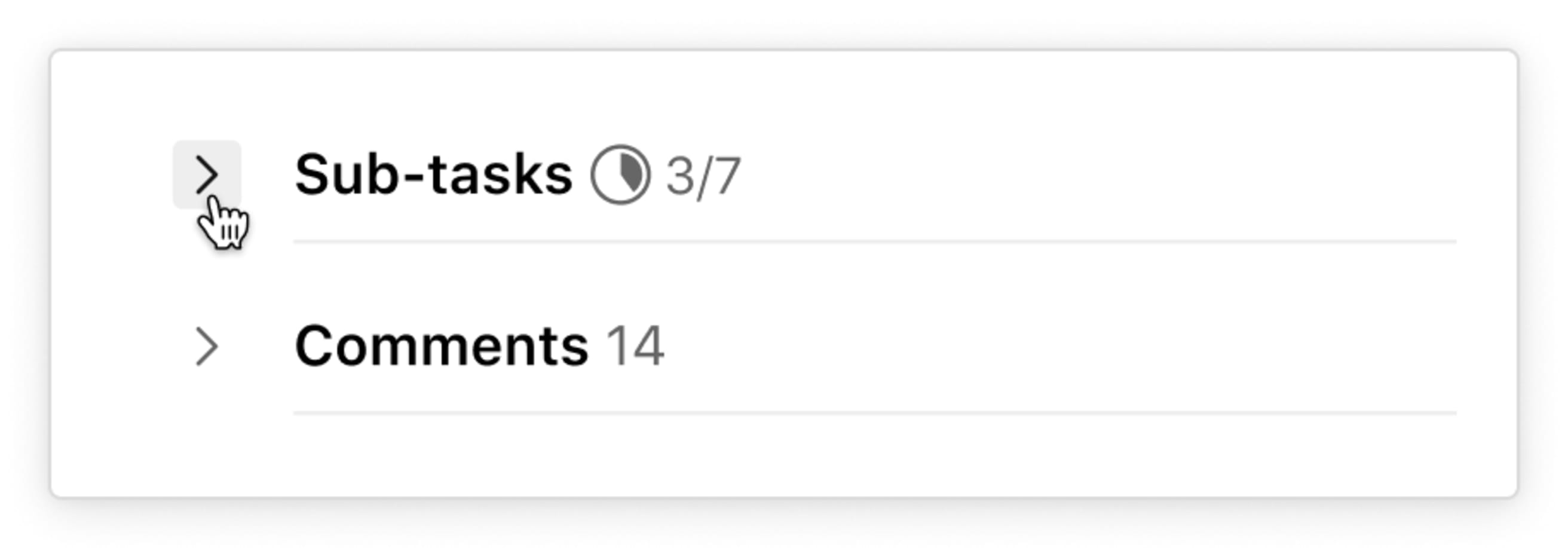
That’s why we added buttons to collapse sub-tasks and comments. On the left side of each we offer convenient chevron buttons, so you can hide those sections and focus on the ones you care about most in that moment.
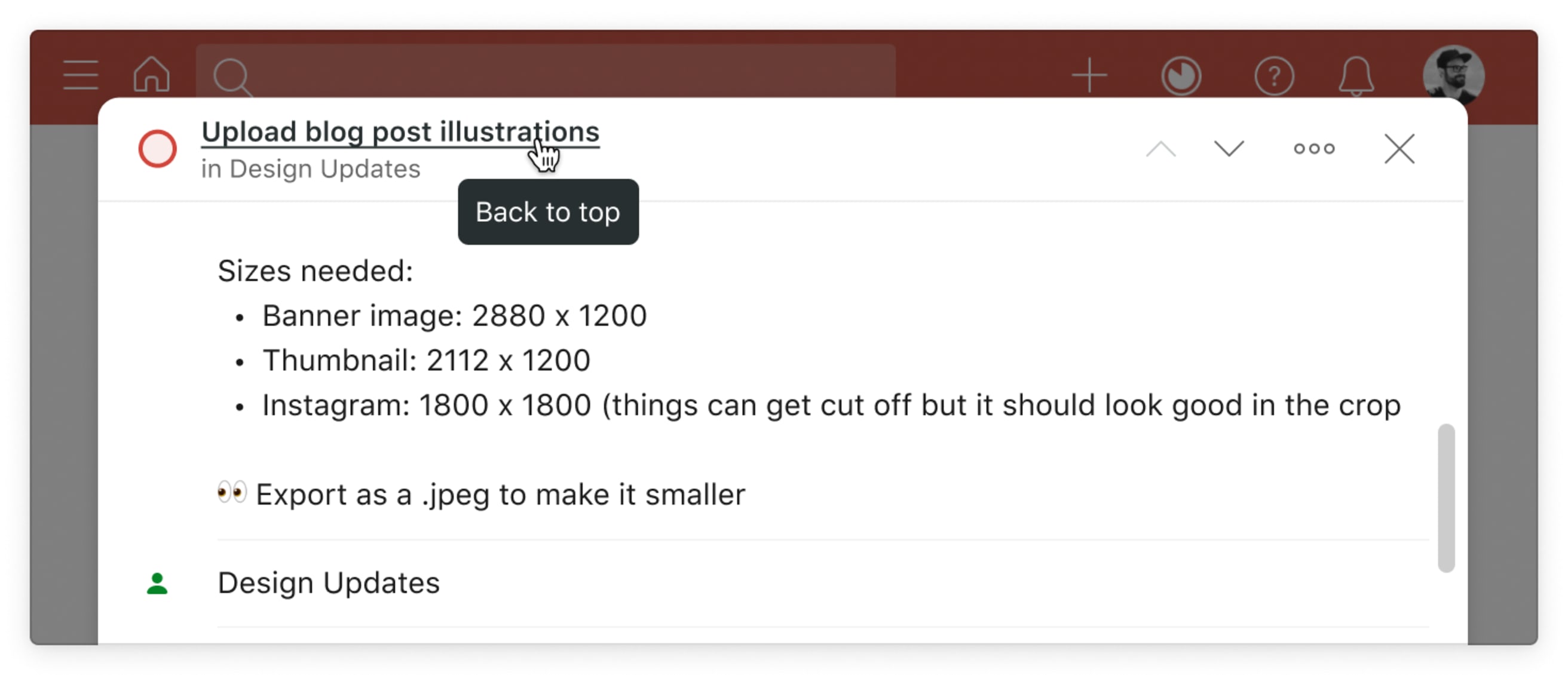
Header collapses when scrolling: When you need to scroll inside a long task, you might forget what the task is even about! Worry no more. The task name, including checkbox, project (and section) stays visible in a minimized version inside the top bar. Referencing the task name when writing a long comment has never been easier. Go back to the top by clicking the task name.
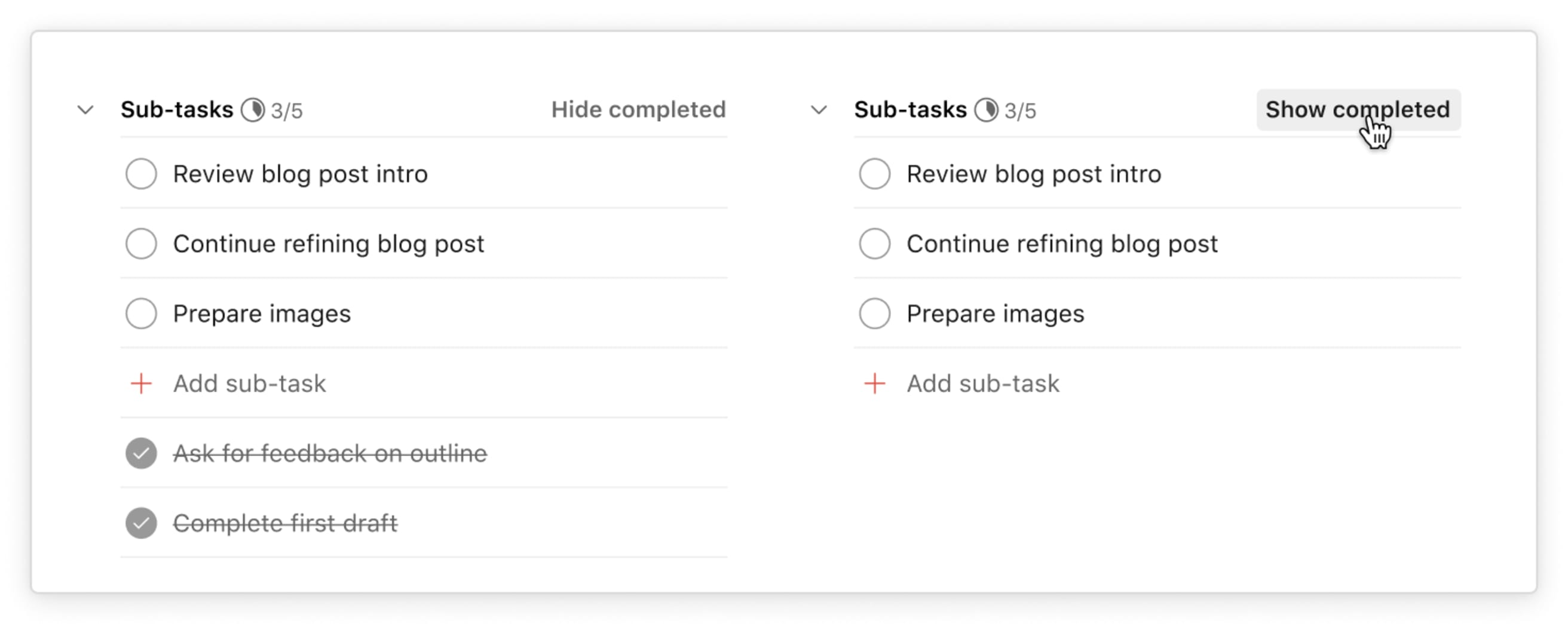
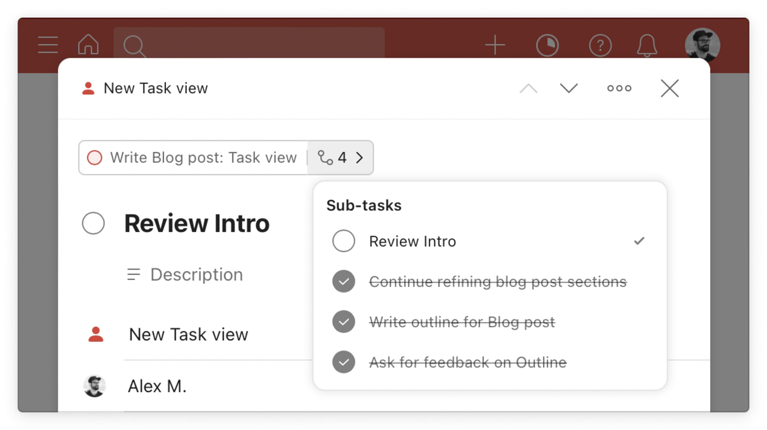
Sub-tasks progress: Sub-tasks now include a small pie chart and completion number to show your progress. With the simple press of a button, you can also decide to show or hide completed sub-tasks—no more digging in a separate menu.
Write and read longer descriptions: The new layout allows for a much more comfortable viewing and editing experience of longer text – in the task name, description, and comments.
Optimized for narrow views: If you use Todoist in a narrow view in the browser, Windows, Mac app, or in a browser extension, the new “Mini view” layout is optimized for your viewing experience and borrows its design from our mobile apps. So, switching from platform to platform is even more seamless.
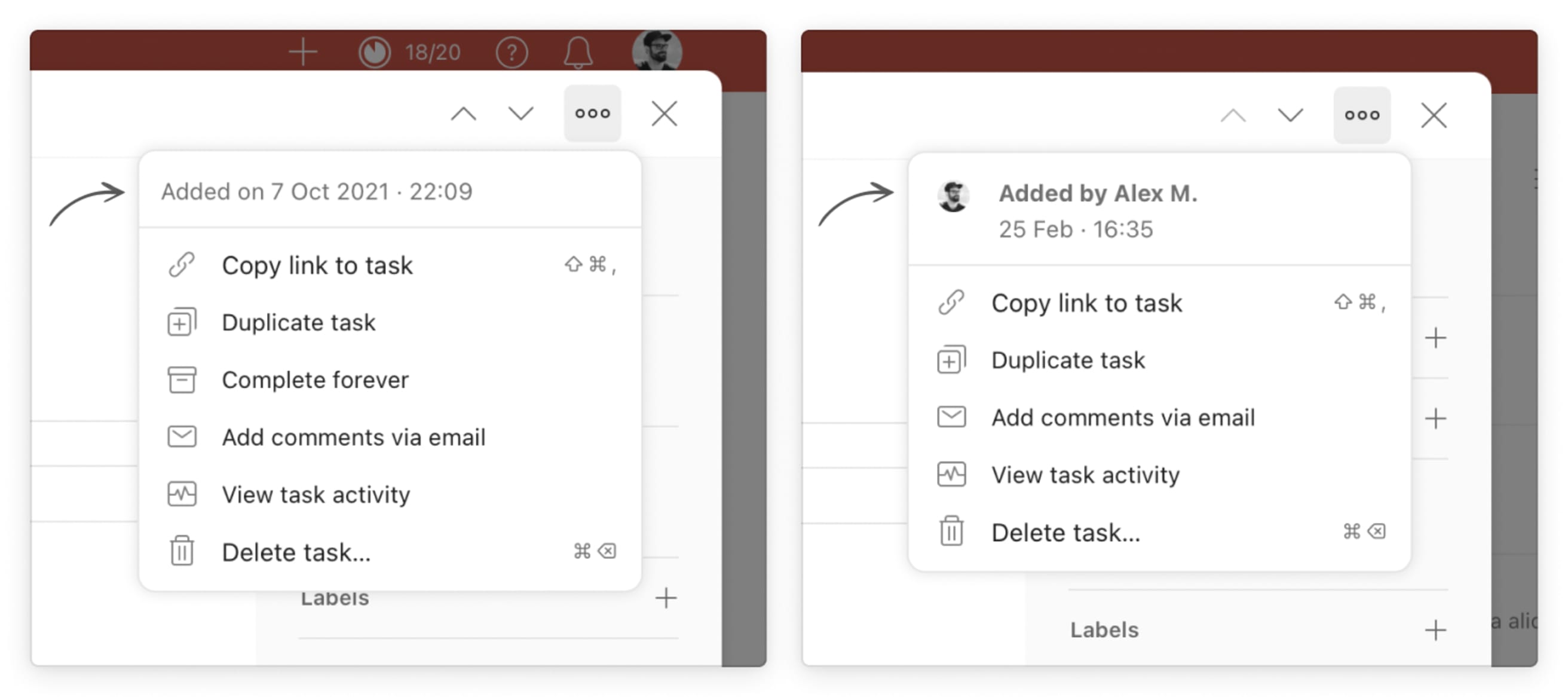
Quickly see who created the task: Open the three dots menu on the top right corner to see who created the task. Here you’ll also find the activity log, duplicate the task, and more.
⚡️ Improved speed
Task navigation: Have you ever wished to sift through your task details at lightning speed? Getting a quick glimpse at the task names, description, and comments? Well, now you can. When you open a task, navigate from task to task via the up and down chevron buttons on the top right, or use the keys `K` (previous task) and `J` (next task) to navigate tasks in your current list.

Parent and sub-task navigation: If your task has tons of sub-tasks it’s now easy as pie to see and navigate to each individual sub-task. A new separate field now displays the parent and its sub-tasks. It allows you to quickly and easily navigate back and forth between your parent and sub-task structure.
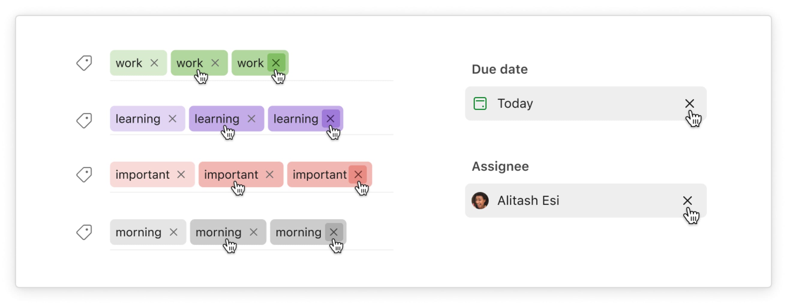
Faster micro-interactions: Sometimes, you need to quickly change a thing or two. You may decide to unassign the task, remove a label or remove the due date. That’s now possible with the simple click of a button: There is an X icon ready when you are.
Including various shortcuts: Any shortcuts you are already familiar with are supported in our new design, like moving a task, changing the priority, or deleting the task.
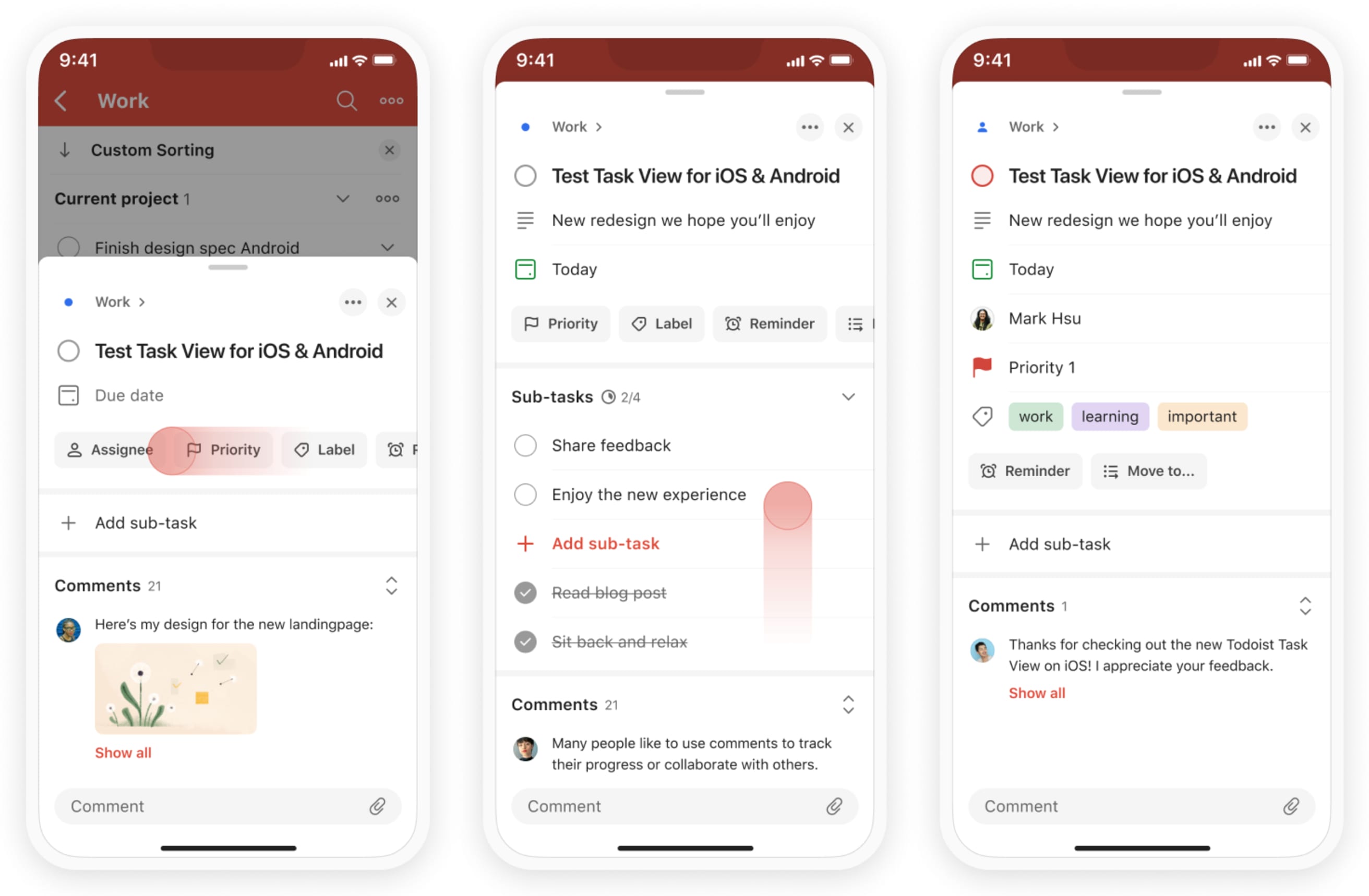
📱 Mobile optimizations
Structured layout: Each task attribute now has its own row to make it easier to get a complete overview of all task details.
We also introduced attribute chips with labels to improve the accessibility of adding a new task attribute. You can reach them directly after the task name.
Comments section: Many people like to use comments to track their progress or collaborate with others. Comments are no longer hidden behind an icon, but you can now see a preview of the last comment in our new Comments section. The new sticky comment bar makes it really quick to add new comments and attachments.
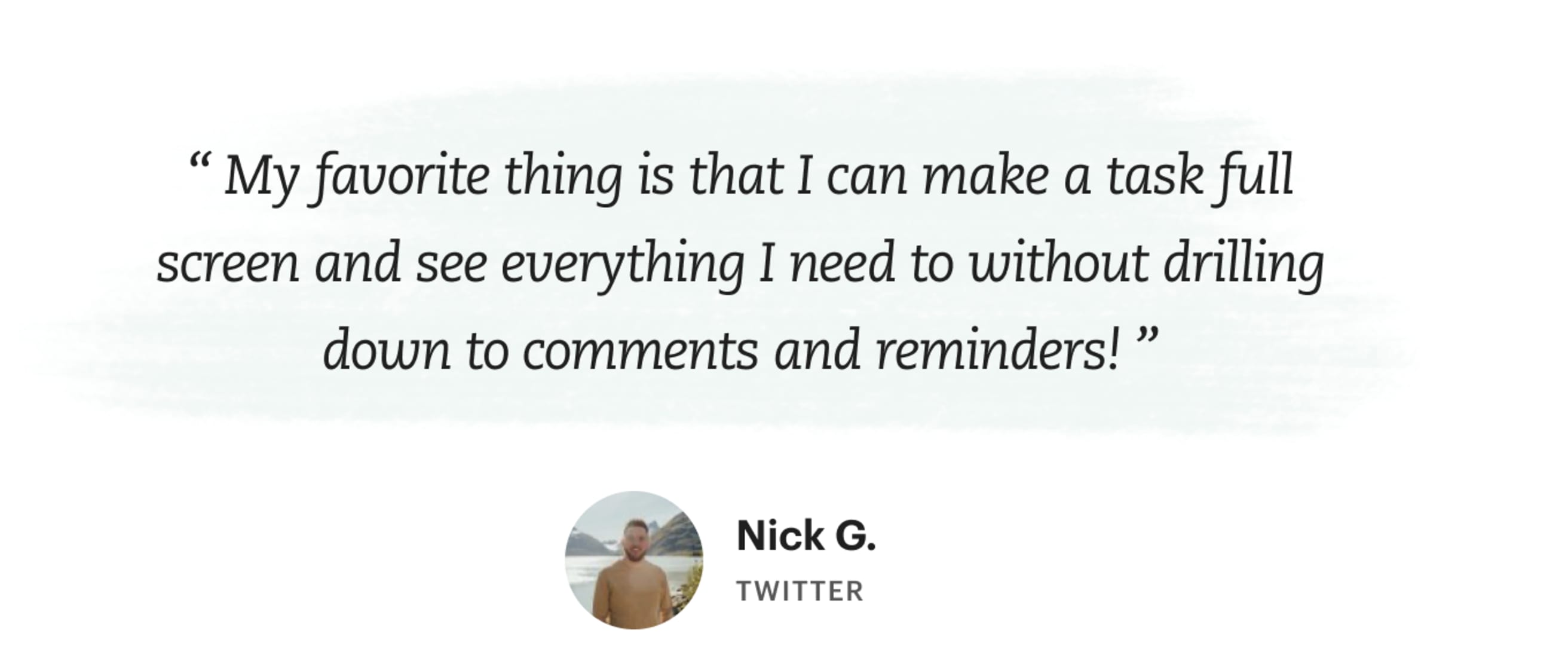
Our Experimentalists have been using the new task view for a while now. They were fundamental in helping us shape this new feature. Here’s what they had to say:


How the design process went
Many months of iteration led us to the final result you see today. The biggest design challenge was to design a task view that utilizes the space more efficiently while being flexible for various use cases. It needed to work for simple tasks like “Take vitamins”, and very complex tasks like “Coordinate next month's budget” that contains multiple sub-tasks and comments with your team.
“We constantly iterated details in the layout, optimized font sizes and brought more consistency to the sidebar.” – Alex M., Product Designer
For example, in case you don't need a reminder or label, attributes are compact but visible.
During the design process we included the feedback of Experimentalists over 4 months and more than 1000 survey responses, multiple in-person interviews, tweets and support requests. It’s inspiring to see such a passionate community actively contributing to a product development process. Thank you!
We’d love to hear how you use the new Task view, so share your workflows with us on Twitter @todoist or Instagram @todoistofficial.